251013 TIL
2025. 10. 13. 18:04ㆍCourses/아이티윌 오라클 DBA 과정
matplotlib
선 그래프
# 선그래프
# -> 한가지 지표에 대한 특정 기준
# -> (주로 시간)에 따른 변화

# matplotlib 패키지
# ->데이터를 차트나 플롯(Plot)으로 그려주는 패키지

# matplotlib 패키지 설치
# >pip install matplotlib

import numpy as np
from matplotlib import pyplot as plt

# 1)
data = [10, 11, 12, 13, 14]

# 그래스 설정 시작
# -> 모든 그래프 작업 시작시 호출
plt.figure()

# 데이터를 선그래프로 표현
# ->리스트의 각 값은 y축이 되고,
# ->리스트 값의 인덱스는 x축이 된다.
plt.plot(data)
# 그래프 표시하기
plt.show()
# 그래프 관련 설정 해제
plt.close()https://www.w3schools.com/colors/colors_hexadecimal.asp
Sample.py
# 그래프 그리기에서 사용될 샘플 데이터
# -----------------------------------------------------
# 년도별 신생아 수
newborn = [436455, 435435, 438420, 406243, 357771]
year = [2013, 2014, 2015, 2016, 2017]
# 2017년 1월~12월까지 도시별 교통사고 건수
seoul = [3166, 2728, 3098, 3172, 3284, 3247, 3268, 3308, 3488, 3312, 3375, 3179]
busan = [927, 857, 988, 955, 1014, 974, 1029, 1040, 1058, 971, 958, 982]
daegu = [933, 982, 1049, 1032, 1083, 1117, 1076, 1080, 1174, 1163, 1146, 1135]
inchun = [655, 586, 629, 669, 643, 627, 681, 657, 662, 606, 641, 663]
label = [
    "1월",
    "2월",
    "3월",
    "4월",
    "5월",
    "6월",
    "7월",
    "8월",
    "9월",
    "10월",
    "11월",
    "12월",
]
# 온도와 아이스크림 판매 수량
tmp = [23, 25, 26, 27, 28, 29, 30, 31, 33]
qty = [21, 23, 25, 28, 33, 35, 36, 32, 39]
import numpy as np
from matplotlib import pyplot

# 데이터 참조(sample.py)
from sample import newborn  # 신생아수
from sample import year # 년도
# 문제) sample.py의 newborn리스트값에서 최대값, 최소값을 각각 출력하시오
print("최대값 : %d" % np.max(newborn))
print("최대값 : %d" % np.min(newborn))최대값 : 438420
최대값 : 357771
# 1) 기본형
pyplot.figure()
pyplot.plot(newborn)
pyplot.show()
pyplot.close()
#2) 축제목, 선 종류, 선 색
pyplot.figure()
pyplot.plot(newborn, label="Baby Count", linestyle="--", marker=".", color="#ff2900")
pyplot.legend() #label 속성 적용
pyplot.grid()   #배경에 그리드 표시
pyplot.savefig("line1.png")
pyplot.show()
pyplot.close()
# 3)
pyplot.figure()
pyplot.plot(newborn, label="Baby Count", linestyle="--", marker=".", color="#ff2900")
pyplot.legend()                      #label 속성 적용
pyplot.grid()                        #배경에 그리드 표시
pyplot.title("NewBorn baby of Year") #그래프 제목
pyplot.xlabel("year")                #x축 제목
pyplot.ylabel("newborn")             #y축 제목
pyplot.xticks([0, 1, 2, 3, 4], year) #x축의 각 위치에 year값을 라벨로 적용
pyplot.savefig("line3.png")
pyplot.show()
pyplot.close()
from sample import seoul, busan, daegu, inchun, label

#시스템 글꼴폴더(C:\Windows\Fonts)에서 확인
#굴림보통 gulim, 바탕batang
#한글폰트(.ttf) 설정
pyplot.rcParams["font.family"] = "batang"
pyplot.rcParams["font.size"] = 12

pyplot.figure()
pyplot.grid()

#그래프 제목, x, y축 라벨 설정
pyplot.title('2017년 주요도시 교통사고')
pyplot.xlabel('월')
pyplot.ylabel('교통사고')

pyplot.plot(seoul, label = '서울')
pyplot.plot(busan, label = '부산')
pyplot.plot(daegu, label = '대구')
pyplot.plot(inchun, label = '인천')

pyplot.legend(title='도시', loc='upper right', shadow=True) #범례 적용

#pyplot.savefig('traffic1.png', dpi=200) #해상도 dpi=100 기본값

#x,y축의 범위 설정
pyplot.xlim(0,11)
pyplot.ylim(0,4000)

#x축의 각 지점에 적용될 라벨 설정
#-> 0부터 1씩 증가하는 label리스트 만큼의 크기를 갖는 리스트
x = list(range(0, len(label))) #0~11

#-> x 리스트의 각 좌표에 지정될 라벨 설정
pyplot.xticks(x, label)

pyplot.show()
pyplot.close()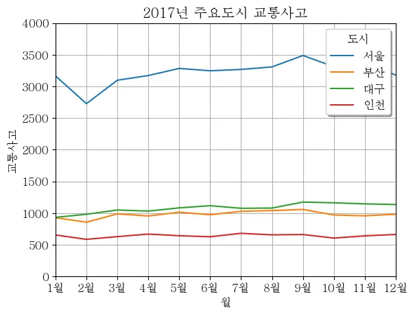
막대 그래프
# 막대그래프
# -> 범주, 빈도 데이터를 요약해서 보여주는 그래프
# 모듈참조 (sample.py)

import numpy as np
from matplotlib import pyplot
from sample import newborn, year, seoul, busan, daegu, inchun, label

pyplot.rcParams["font.family"] = 'gulim'
pyplot.rcParams["font.size"]   = 12

#생성될 결과물의 가로,세로 크기 (inch단위)
pyplot.rcParams["figure.figsize"] = (6, 4)
# 1)
pyplot.figure()
#세로 막대 그래프
#-> bar() 함수의 기준축은 x방향임
pyplot.bar(year, newborn, label="신생아 수")
pyplot.legend()
pyplot.xlabel("년도")
pyplot.ylabel("신생아 수")
pyplot.ylim(350000, 450000)
pyplot.title("년도별 신생아수")
pyplot.grid()
#pyplot.savefig('box.png')
pyplot.show()
pyplot.close()
# 2) 다중 막대 그래프
pyplot.figure()

# 막대그래프 기준축에 대한 좌표를 표현한 배열 생성 (0~11)
x = np.arange(len(label)) #0~11

#기준축(x축)의 좌표와 굵기를 설정한 막대그래프
pyplot.bar(x, seoul, label="서울", width=0.4, color="#ff6600")
pyplot.bar(x, busan, label="부산", width=0.4, color="#0066ff")

pyplot.xticks(x, label)
pyplot.legend()
pyplot.xlabel('월')
pyplot.ylabel('교통사고 수')
pyplot.ylim(0,4000)
pyplot.title('2017년 서울,부산 교통사고 현황')

pyplot.show()
pyplot.close()
# 3) 가로 막대 그래프
pyplot.figure()

# -> barh() 함수의 기준축은 y
pyplot.barh(year, newborn, label = "신생아 수")
pyplot.legend()
pyplot.ylabel("년도")
pyplot.xlabel("신생아 수")
pyplot.xlim(360000, 450000)
pyplot.title("년도별 신생아수")
pyplot.show()
pyplot.close()
# 4) 다중 가로 막대 그래프
y = np.arange(len(label))

#기준축(y축)의 좌표와 굵기를 설정한 막대그래프
pyplot.barh(y-0.1, seoul, label="서울", height=0.4, color="#ff6600")
pyplot.barh(y+0.1, busan, label="부산", height=0.4, color="#0066ff")
pyplot.yticks(y, label)
pyplot.legend()
pyplot.ylabel('월')
pyplot.xlabel('교통사고 수')
pyplot.xlim(0,4000)
pyplot.title('2017년 서울,부산 교통사고 현황')

pyplot.show()
pyplot.close()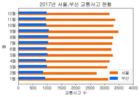
산점도 그래프
# 산점도 그래프
# ->두 변수 간의 영향력을 보여주기 위해
#   가로축과 세로축에 데이터 포인트를 그리는 그래프
# ->두가지 수치에 대한 관계를 추론하기 위한 근거(상관분석)

#모듈참조 samply.py
from matplotlib import pyplot
from sample     import tmp     #온도
from sample     import qty     #아이스크림 판매량

pyplot.rcParams["font.family"] = 'gulim'
pyplot.rcParams["font.size"]   = 12
pyplot.rcParams["figure.figsize"] = (6, 6)
pyplot.figure()
pyplot.scatter(tmp, qty, color='#ff6600', label='판매수량')
pyplot.legend()
pyplot.grid()
pyplot.title('기온과 아이스크림 판매수량의 관계')
pyplot.ylabel('아이스크림 판매수량')
pyplot.xlabel('기온')
pyplot.show()
pyplot.close()
원형 그래프
# 원형그래프
# 전체를 기준으로 한 부분의 상대적 크기를 표시하는 그래프
from matplotlib import pyplot

pyplot.rcParams["font.family"] = 'gulim'
pyplot.rcParams["font.size"]   = 12
pyplot.rcParams["figure.figsize"] = (6, 4)
pyplot.figure()
# 표시할 데이터 설정
# -> 총 합이 100이 아닐 경우 라이브러리가 자동으로 비율을 계산함
ratio = [3700, 2800, 1300, 590, 600]
# 각 항목의 라벨
labels = ['Apple', '삼성', 'LG', 'Sony', '기타']
# 각 항목의 색상
colors = ['#ff6600', '#ff00ff', '#ffff00', '#00ffff', '#0066ff']
# 확대비율
explode = [0.0, 0.0, 0.0, 0.2, 0.1]
#파이차트 표시
#-> autopct 파라미터 설정 안할 경우 수치값 표시 안됨
# 의미: %0.2f (소수점 2째 자리까지 표시) + %% (순수한 %기호)
#-> startangle 기본값은 0도
#-> 각 데이터 항목들은 반시계 반향으로 회전하면서 배치됨
pyplot.title('스마트폰 점유율')
pyplot.pie(ratio #데이터
,labels=labels #라벨
,colors=colors #색상
,explode=explode #확대비율
,autopct='%0.2f%%' #수치값 표시 형식
,shadow=False #그림자
,startangle=90) #시작각도
pyplot.show()
pyplot.close()
Tensorflow
import tensorflow as tf
import numpy as np

xData = np.array([1,2,3,4,5,6,7], dtype=np.float32)
yData = np.array([25000,55000,75000,110000,128000,155000,180000], dtype=np.float32)

model = tf.keras.Sequential([tf.keras.layers.Dense(1, input_shape=[1])])
model.compile(optimizer='sgd', loss='mse')
model.fit(xData, yData, epochs=500, verbose=0)

print(model.predict(np.array([[8]], dtype=np.float32)))
Dataframe
#DataFrame
#->2차원 자료구조. 행과 열이 있는 테이블 데이터(Table Data) 처리
#->엑셀
"""
    ● pandas 패키지
      - 데이터 분석용 라이브러리
      - 자료형 : Series(1차원), DataFrame(2차원), Panel(3차원)

    ● 모듈설치
      >pip list
      >pip install pandas
"""

from pandas import DataFrame
from sample2 import grade_listgrade_list[[98, None, 88, 64],
[88, 90, 62, 72],
[92, 70, None, None],
[63, 60, 31, 70],
[120, 50, None, 88]]
df = DataFrame(grade_list)
df
type(df)pandas.core.frame.DataFrame
df[0]0 98
1 88
2 92
3 63
4 120
Name: 0, dtype: int64
# 컬럼(열) 이름을 지정하여 새로 생성
c_names = ["국어", "영어", "수학", "과학"]

df = DataFrame(grade_list, columns=c_names)
df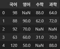
# 인덱스(행) 이름을 지정하여 새로 생성
i_names = ['무궁화', '홍길동', "개나리", "진달래", "봉선화"]
df = DataFrame(grade_list, index=i_names)
df
# 인덱스와 컬럼 이름 모두 지정하기
df = DataFrame(grade_list, columns=c_names, index=i_names)
df
# 열 읽기
df["국어"]
무궁화 98
홍길동 88
개나리 92
진달래 63
봉선화 120
Name: 국어, dtype: int64
# 행 읽기
df.loc["무궁화"]
국어 98.0
영어 NaN
수학 88.0
과학 64.0
Name: 무궁화, dtype: float64
print("무궁화의 국어 점수 : %d" % df["국어"].loc["무궁화"])
print("무궁화의 국어 점수 : %d" % df.loc["무궁화", "국어"])
무궁화의 국어 점수 : 98
무궁화의 국어 점수 : 98
"""
-----------------------------------------------
    count 각 열별로 유효한 값의 수
    mean  평균
    std   표준편차
    min   최소값
    max   최대값
    사분위수 : 1사분위 수(하위 25%)
              2사분위 수(중앙값 50%)
              3사분위 수(하위 75%)   ->상위 25%
--------------------------------------------------
"""

df.describe()
print(df.count())
print(df['영어'].count())
print(df['영어'].min())
print(df['영어'].max())
print(df['영어'].sum())
print(df['영어'].std())
print(df['영어'].median())
print(df.quantile(q=0.25))
국어 5
영어 4
수학 3
과학 4
dtype: int64
4
50.0
90.0
270.0
17.07825127659933
65.0
국어 88.0
영어 57.5
수학 46.5
과학 68.5
Name: 0.25, dtype: float64
데이터 전처리 Data Preprocessing
분석에 적합하게 데이터를 가공하는 작업
#'axis=1' 을 설정하면 각각의 행에 대해 계산함
# NaN은 대상에서 제외
df["평균"] = df.mean(axis=1)
df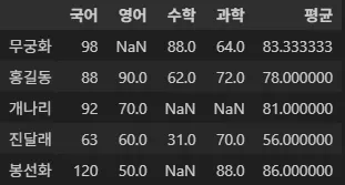
import numpy as np
#[결과] -> 평균칼럼의 점수가 70점이상이면 합격, 불합격
df["결과"] = np.where(df["평균"] >= 70, "합격", "불합격")
df
#[학점] -> 평균 점수에 따라 A, B, C, D
conditions = [(df["평균"] >= 90), (df["평균"] >= 80), (df["평균"] >= 70), (df["평균"] < 60)]
grade = ["A", "B", "C", "D"]
df["학점"] = np.select(conditions, grade, "F")
df
# 상자그림 (boxplot)
from matplotlib import pyplot

pyplot.rcParams["font.family"] = 'gulim'
pyplot.rcParams["font.size"]   = 12
pyplot.rcParams["figure.figsize"] = (6, 4)

pyplot.figure()
pyplot.grid()
df.boxplot('국어')
pyplot.title("2025년 국어점수 분포도")
pyplot.ylabel("국어점수")
pyplot.show()
pyplot.close()
데이터 정제
- 결측치 (Missing value) : 누락된 값, 비어 있는 값
- 이상치 (Outlier) : 정상 범주에서 크게 벗어난 값
from sample2 import grade_dic

# 데이터 구성하기
df = DataFrame(grade_dic, index=i_names)
df
# 결측치 여부 확인
# -> isnull(), isna() 함수
empty = df.isna()
empty
empty = df.isnull()
empty
# 국어 점수에 대한 이상치 필터링
r = df.query('국어 > 100')
r
# 국어점수(120) 이상치가 있는 인덱스 값 얻어오기
r_index = list(r.index)
r_index
['봉선화']
# 이상치를 갖는 인덱스에 대한 국어 점수를 결측치로 변경
for i in r_index:
    df.loc[i, '국어'] = np.nan
df
WordCloud
# Word Cloud
# 텍스트마이닝(Text mining)
# ->문자로 된 데이터에서 가치 있는 정보를 얻어 내는 분석기법

# 형태소분석
# ->문장을 구성하는 어절들이 어떤 품사로 되어 있는지 파악

# KoNLPy
# ->한글 자연처 처리에 맞춤화된 파이선 라이브러리
# ->한글 형태소 분석기

"""
   워드 크라우드 관련 모듈 설치
   pip list
   pip install wordcloud
"""
from matplotlib import pyplot
from wordcloud import WordCloud
text = ""
with open("res/이상한나라의앨리스.txt",'r', encoding="UTF-8") as f:
text = f.read()
text'\ufeffProject Gutenberg's Alice's Adventures in Wonderland, by Lewis Carroll\n\nThis eBook …
# WordCloud 클래스의 객체 생성
wc = WordCloud(
    width=1200, # 모니터 해상도 가로크기
    height=800, # 모니터 해상도 세로크기
    scale=3.0 # 보고서용, 인쇄용으로는 2, 3배는 크게해야 함
)
#WordCloud 객체를 사용하여 텍스트에 대한 단어 빈도수 추출
#{'단어':빈도수, '단어':빈도수, ~~~ } 딕셔너리 형식
gen = wc.generate(text)
gen.words_
pyplot.figure()

#그래픽 표시 데이터를 단어 빈도수에 대한 딕셔너리로 지정
#interpolation : 워드클라우드에 등록되어 있는 정렬방식
pyplot.imshow(gen, interpolation="bilinear")

wc.to_file("alice.png") #크기는 scale에서 조정가능

pyplot.show()
pyplot.close()
'Courses > 아이티윌 오라클 DBA 과정' 카테고리의 다른 글
| 251015 TIL (0) | 2025.10.15 |
|---|---|
| 251014 TIL (0) | 2025.10.14 |
| 251010 TIL (0) | 2025.10.10 |
| 251002 TIL (0) | 2025.10.02 |
| 251001 TIL (0) | 2025.10.01 |